Meta description: Permit reviewers don't just want ADA intent. They want proof. This guide shows exactly what to place on site plans for permit submissions, from accessible routes and parking layouts to curb ramps, entrances, and QA checks that prevent accessibility comments.
You can have an accessible design and still get hit with plan check comments if the site plan doesn't prove compliance. That's the part many teams learn the hard way.
Most accessibility comments on permit sets aren't about broad ADA awareness. They come from missing graphic evidence. The route is implied but not traced. Parking is counted but not dimensioned. A curb ramp is tagged, but the landing, slope, and detectable warning aren't shown. The grading sheet says one thing, the architectural site plan suggests another, and the reviewer sends it back.
For production teams building site plans for permit, ADA site accessibility has to be treated as a documentation system. That means a repeatable graphic language, consistent annotation, and a QA pass that checks the site plan against grading, civil, and door conditions before submittal. If that system is missing, comment cycles multiply fast.
The Legal Framework for Site Accessibility
Before anyone starts drawing accessible parking or tracing a route of travel, the team has to identify which rule set governs the job. That sounds basic, but it's where many coordination problems start.
On permit drawings, reviewers usually enforce IBC Chapter 11 and ICC A117.1 through the local building code. The 2010 ADA Standards for Accessible Design still matter, but ADA itself is a civil rights law. It isn't the same as the building code review process. In practice, that means the building official checks code compliance at permit, while the project still carries ADA obligations after approval.
Know which standard controls the sheet
Private commercial work usually sits under three overlapping layers:
- Federal accessibility law through ADA
- Building code requirements through IBC and ICC A117.1
- State accessibility rules where the state is stricter than the federal baseline
For federally funded work, the Architectural Barriers Act can also enter the picture. That doesn't affect every private project, but public and government-related work can trigger it.
The production rule is simple. Use the most restrictive applicable requirement and document to that level on the permit set.
Production note: Don't let the code summary stay generic. If the jurisdiction has state-specific accessibility standards, name them directly in the sheet notes and coordinate details to that standard.
Jurisdiction changes break templates
Regional firms run into trouble when they assume one office standard will pass in every municipality. It won't. Compliance variations across jurisdictions are a real operational blind spot, especially where digital submission workflows and fragmented local requirements collide, as noted in this discussion of jurisdiction differences and permitting workflow challenges.
That's why code path review belongs at the start of setup, not at redline. If your team is already sorting occupancy, use, and code basis across projects, this comparison of IRC vs IBC requirements is a useful checkpoint before the site plan template gets populated.
Documenting the Accessible Route
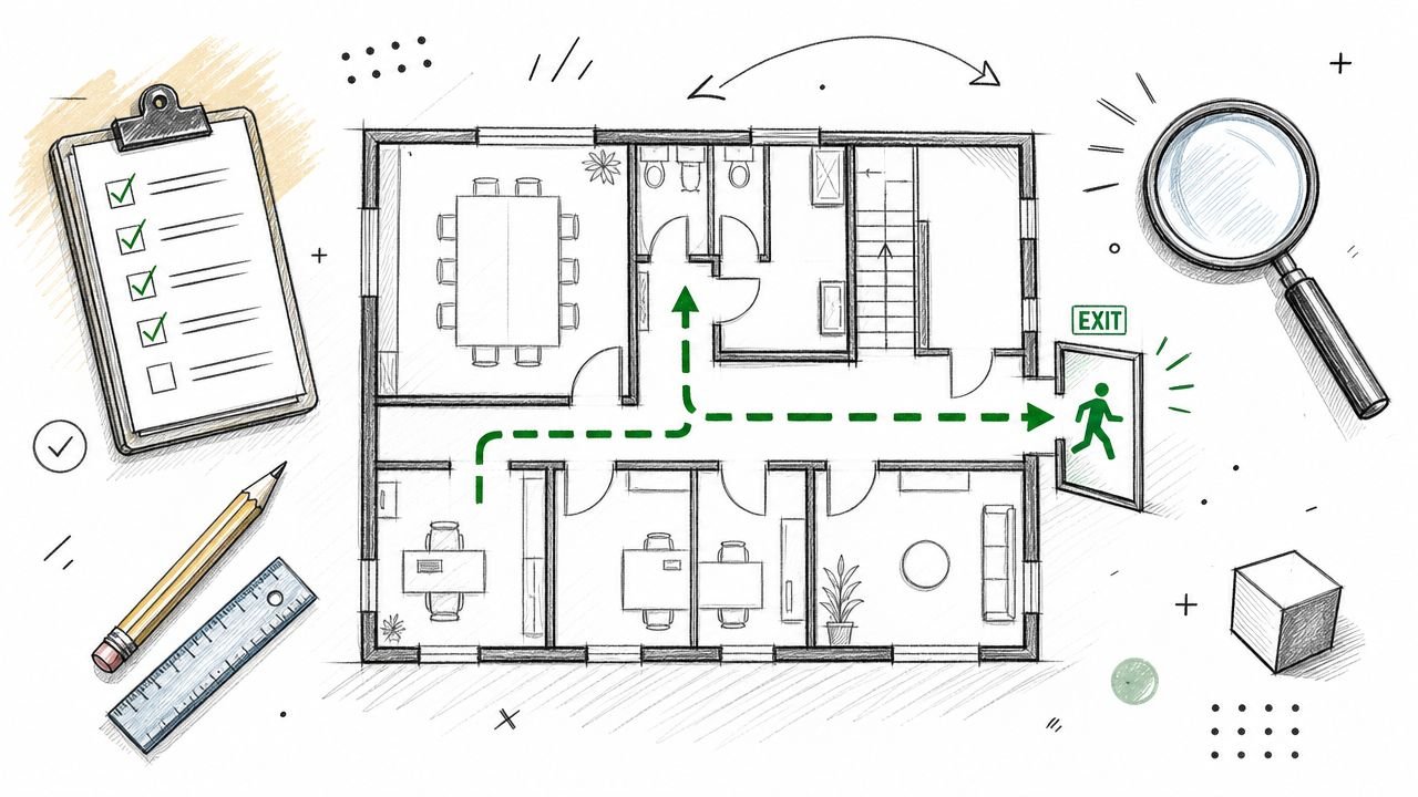
The accessible route is the spine of ADA site plan permit accessibility. If the reviewer can't follow it without guessing, the sheet isn't done.
On a permit site plan, the route should read as a continuous, deliberate path connecting accessible parking, passenger loading when provided, adjacent public sidewalk or street access where applicable, and the accessible building entrance. It should not disappear at the curb, stop at the face of building, or jump between sheets without a clear reference.
Show the route as a graphic system
Don't rely on a note that says “accessible path provided.” Draw it so the reviewer can trace it in seconds.
A clean setup usually includes:
- A dedicated line type or hatch that appears only for the accessible route
- Legend identification so the route reads consistently across sheets
- Directional continuity through parking, walks, curb ramps, and entrance landings
- Callouts at every transition point where width, slope, or material changes
If you're working in Revit or AutoCAD, put this on a separate accessibility layer or subcategory so it can be isolated during QA.
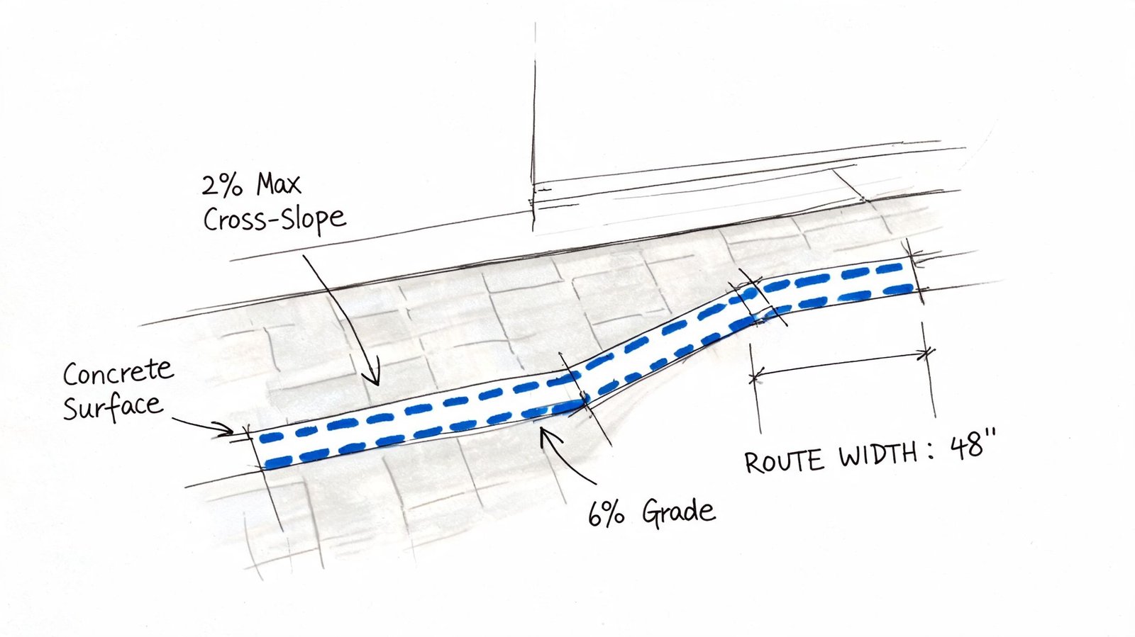
Dimension the route where review comments happen
Most teams remember the route. Fewer teams dimension the route where it narrows.
For permit review, show the clear width at constrained points such as bollards, columns, planters, bike racks, gate posts, or retaining wall returns. The brief for this article calls out 44 inches minimum clear width per IBC, with 36 inches minimum under ADA in some configurations. If the route pinches, dimension it. Never force the reviewer to scale the drawing.
Be sure to indicate the walking surface. Loose gravel, unstable pavers, turf, and decorative finishes without a solid foundation lead to preventable comments. The document must specify a firm, stable surface, and that notation should correspond with the site design and hardscape plans.
A route that exists in concept but not in linework will still get rejected in plan check.
Coordinate slope with grading before submittal
Many otherwise solid site plans fail at this stage. The architectural sheet says the route is accessible. The grading plan sends drainage across it too aggressively, or the curb transition creates a noncompliant cross-slope.
Use a quick QA pass that checks:
- Cross-slope shown and coordinated, with a maximum of 2%
- Running slope shown where grade changes occur, with a maximum of 5% before a ramp condition is required
- Surface transitions at walk-to-ramp, ramp-to-landing, and landing-to-threshold
- No routing behind parked vehicles unless the lot configuration clearly protects that movement
- Connection to the actual accessible entrance, not just the building perimeter
When teams skip this pass, they usually get accessibility comments from one reviewer and grading comments from another. That's a preventable loop.
Accessible Parking Count Configuration and Dimensions
Accessible parking gets reviewed hard because it's easy to verify and easy to mark up. If the count is wrong, if the van ratio is missing, or if the dimensions aren't drawn on plan, the reviewer doesn't need much time to issue comments.
That makes parking one of the most important parts of ADA compliance site plan documentation.
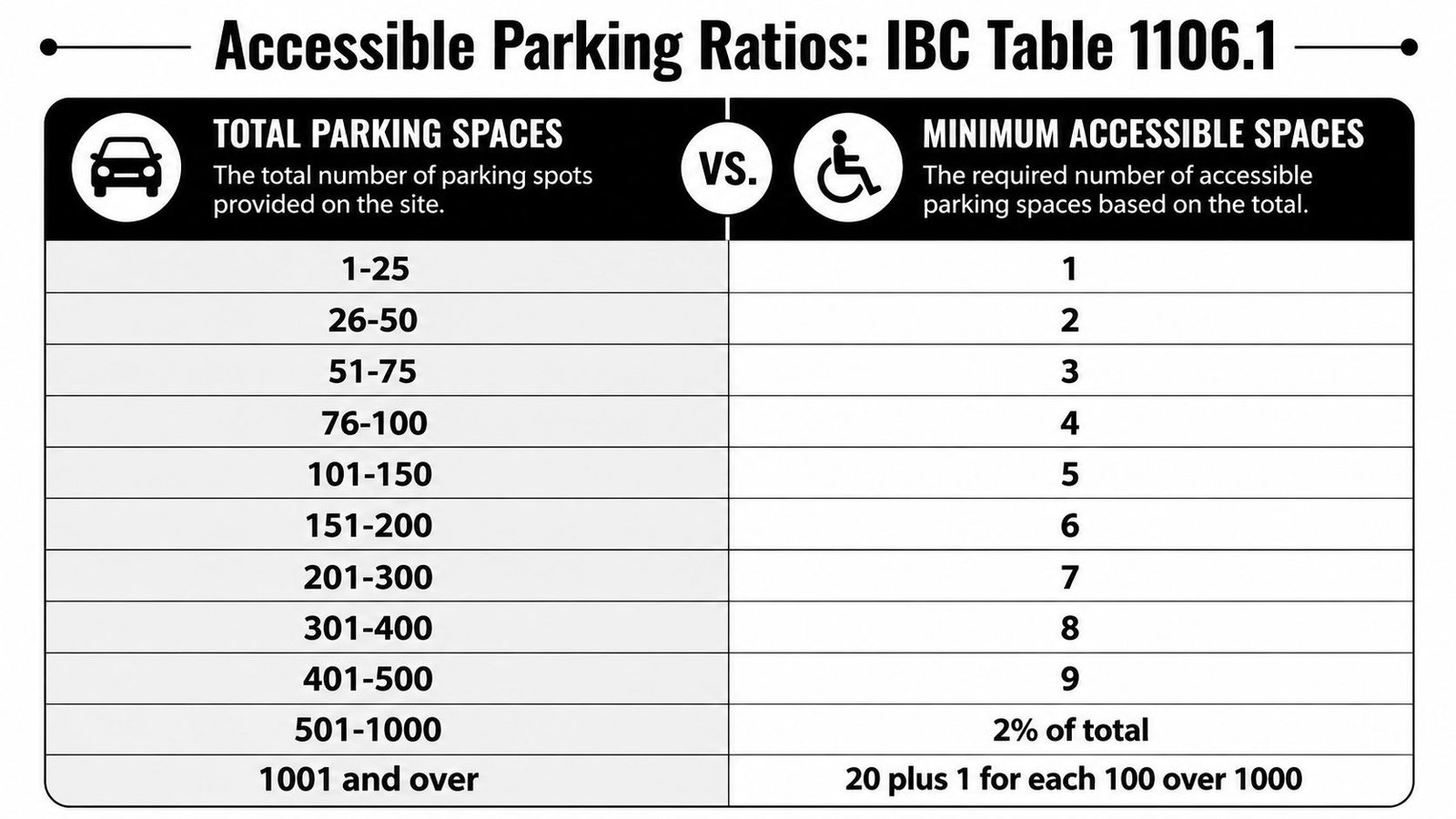
Use a parking count table the reviewer can verify quickly
Below is the count framework referenced in the brief as IBC Table 1106.1 Required Accessible Parking Spaces.
| Total Parking Spaces Provided | Required Minimum Accessible Spaces |
|---|---|
| 1 to 25 | 1 |
| 26 to 50 | 2 |
| 51 to 75 | 3 |
| 76 to 100 | 4 |
| 101 to 150 | 5 |
| 151 to 200 | 6 |
| 201 to 300 | 7 |
| 301 to 400 | 8 |
| 401 to 500 | 9 |
| 501 to 1000 | 2% of total |
| 1001 and over | 20 plus 1 for each 100 over 1000 |
The brief also requires this related rule: at least 1 in every 6 accessible spaces must be van accessible, or 1 per lot if fewer than 6 accessible spaces are provided.
For specific occupancies, the brief identifies higher requirements:
- Outpatient medical facilities: 10% of total must be accessible
- Rehabilitation facilities and outpatient physical therapy: 20% of total must be accessible
If your team performs feasibility studies before permit applications, it helps to resolve these counts early. Following a structured architectural feasibility study workflow can protect the permit set from late parking revisions.
Draw the dimensions on the site plan
Reviewers don't want these dimensions buried in a standard detail with no plan confirmation.
Show them directly on the site plan:
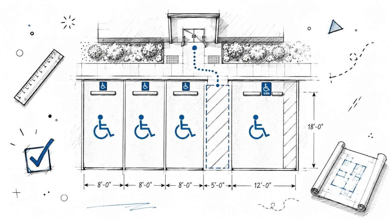
- Standard accessible space: 8 feet wide minimum with a 5-foot-wide access aisle
- Van accessible space: 11 feet wide minimum with a 5-foot access aisle, or 8 feet wide with an 8-foot access aisle
- Stall length: 18 feet minimum
- Access aisle relationship: same level as the parking space, directly connected to the accessible route
Also note striping and signage. A space can be counted correctly and still get flagged if the aisle marking, ISA sign location, or van notation isn't clear.
Location matters as much as math
The accessible spaces need to sit on the shortest accessible route to the accessible entrance. On projects with multiple entrances, don't cluster all accessible spaces at one end of the site if the building entry pattern suggests they should be dispersed.
For covered lots or structured parking, include the required 98 inches minimum vertical clearance for van accessible parking and along the route serving those spaces. If that clearance exists only in detail and not in the site or parking plan notes, expect a comment.
Field lesson: If a parking count schedule and the striping plan disagree, the reviewer will trust neither. Lock those together before issue.
Curb Ramps and Curb Cuts Documentation
Curb ramps are one of the fastest ways to reveal whether a team is documenting accessibility or merely symbolizing it. A generic ramp tag isn't enough.
When the accessible route crosses a curb, the site plan has to identify the curb ramp location and the detail reference has to carry the geometry. The reviewer should be able to move from plan to detail without any guesswork about type, slope, landing, or warning surface.
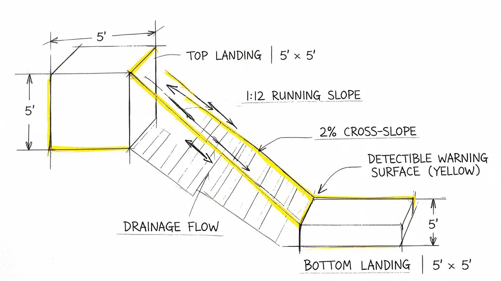
Identify the ramp type and its control points
The brief identifies three common conditions:
- Perpendicular curb ramp
- Parallel curb ramp
- Blended transition
Whichever type you use, label it on plan and point it to a detail that matches the actual site geometry. Don't place a standard curb ramp detail in the set if the field condition at the corner can't physically match it.
For a perpendicular curb ramp, the brief requires the following callouts:
- Maximum running slope: 8.33%
- Maximum flare slope: 10%
- Top landing: 4 feet by 4 feet minimum
Show what affects review and construction
At minimum, the site plan or linked detail needs to show:
- Ramp location on the accessible route
- Slope callouts for running slope and cross-slope
- Landing dimensions at the top and bottom as applicable
- Detectable warning surface with material and contrast note
- Drainage behavior so water doesn't run across the ramp face or landing in a way that conflicts with use
A common miss is drawing the curb ramp where the vehicle overhang intrudes into the path at the bottom. Another is showing the ramp but not the landing, which leaves maneuvering space unresolved.
Don't separate accessibility from drainage in your redlines. At curb ramps, they're the same conversation.
What usually gets flagged
Three failures show up repeatedly in permit review:
Symbol without data
The plan shows a ramp icon, but no slope, no landing size, and no detail reference.Detail mismatch
The detail shows one curb condition, but the site plan geometry or grading implies another.Warning surface omitted
The truncated dome note is missing, too vague, or disconnected from the specific ramp location.
When those issues appear, reviewers often kick the comment to both architecture and civil. That spreads one drafting miss into a multi-discipline correction cycle.
Accessible Building Entrance Documentation
The accessible route ends at the entrance, and that handoff from site to door needs to be explicit. Many site plans stop one step too early.
The sheet should identify which entrances are accessible and show the landing and maneuvering space at those doors. The brief notes that at least 60% of entrances must be accessible per IBC, and the primary public entrance must be accessible. If that's not graphically clear, reviewers will ask for clarification even when the floor plan already suggests it.
Show the entrance as a usable condition
Draw and label:
- Door clear width: 32 inches minimum clear
- Maneuvering clearance: 18 inches minimum on the latch side for a pull-side approach, 12 inches for push side
- Threshold height: maximum 1/2 inch, beveled where required
- Landing at the entrance: maximum 2% slope in any direction
The landing should be dimensioned on plan and checked against the grading sheet. If a planter wall, column, downspout enclosure, or guard return intrudes into the maneuvering area, fix it before issue. That's a classic permit comment because the problem is easy to see once the dimensions are drawn.
Keep the site plan and architectural details aligned
Don't let the site plan show an accessible entrance if the door detail, hardware note, or floor elevation condition tells a different story.
A strong entrance QA check asks:
- Does the accessible route hit the correct door?
- Does the landing slope match civil information?
- Are the maneuvering clearances free of encroachments?
- Is the threshold treatment consistent with the detail set?
If the answer to any one of those is uncertain, the permit reviewer will likely find it.
Passenger Loading Zones and Transit Stops
These items are often omitted because teams focus on parking and forget the broader arrival sequence.
If the project provides a passenger loading zone, the brief states that at least one accessible loading zone is required per IBC 1106.7. On the site plan, show the loading space, the adjacent aisle, and the route connecting it to the accessible entrance. The brief calls for an 8-foot-wide access aisle, a 20-foot-long minimum loading space, and 114 inches minimum vertical clearance.
Transit connections matter too. If a public transit stop sits on or adjacent to the site, the accessible route should connect to it. That connection needs to be visible on the sheet, not left to assumption because the sidewalk exists somewhere off to the edge.
A reviewer reading your site plan should understand how a person arrives without driving, how a passenger is dropped off, and how either route reaches the accessible entrance without interruption.
Setting Up Your Site Plan for Permit Success
Good accessibility documentation isn't a heroic effort at the end of CD production. It's a template discipline.
Start by creating a dedicated accessibility graphic system in Revit or AutoCAD. Put the accessible route, accessible parking, curb ramps, and accessible entrances on controlled layers or subcategories. If those items are drafted ad hoc on every project, consistency disappears and QA gets slower.
Build a checklist into the sheet setup
Incomplete first submissions directly delay approvals, and missing required checklist items are a known cause of permit processing delays, as described in this guidance on site plan approval process and submission completeness.
A reliable internal check should include:
- Accessibility compliance table listing total parking, required accessible spaces, provided accessible spaces, van spaces, and accessible entrance count
- Cross-references from every site accessibility element to its matching detail
- Sheet-to-sheet coordination between architectural site plan, civil grading, site design, and door information
- Black and white readability so accessibility graphics still read clearly in permit archives and reviewer print sets
Use one final coordination pass
Before submittal, isolate the accessibility layer and review the entire route from property edge or parking arrival to door threshold. That single pass catches more permit comments than many professionals expect.
The best production teams also compare the site plan against their standard QA tools. If your office already uses drawing controls for consistency, tie accessibility into the same process rather than treating it as a side check. A permit-focused drawing production workflow for permit drawings should make accessibility visible, coordinated, and repeatable.
Final QA rule: If a reviewer has to infer accessibility from scattered notes, the sheet isn't permit-ready.
If your team is building commercial permit sets and wants stronger support on accessibility-heavy site plans, BIM Heroes helps produce coordinated construction documents and permit drawing packages with production-ready QA workflows. If you'd like a second set of eyes on your template, redline process, or site plan accessibility checklist, it's a practical place to start.